Investigating student stress indicators using UMAP (Kaggle Dataset)
Published:
In this post, I’m going to investigate the underlying relationships between various physical and mental health indicators and student stress levels. In the process I will give an introduction to the Uniform Manifold Approximation and Projection or UMAP dimensional reduction technique.
Resources
As usual, here are some of the resources I’m using as references for this post. Feel free to explore them directly if you want more information or if my explanations don’t quite click for you.
- UMAP: Uniform Manifold Approximation and Projection for Dimension Reduction - Leland McInnes, John Healy, James Melville
- UMAP Uniform Manifold Approximation and Projection for Dimension Reduction | SciPy 2018 | - Leland McInnes
- How UMAP Works - UMAP Documentation
- Uniform Manifold Approximation and Projection (UMAP) and its Variants: Tutorial and Survey - Benyamin Ghojogh, Ali Ghodsi, Fakhri Karray, Mark Crowley
- UMAP: Uniform Manifold Approximation and Projection for Dimension Reduction (Documentation)
- UMAP Dimension Reduction, Main Ideas!!! - StatQuest with Josh Starmer
- UMAP: Mathematical Details (clearly explained!!!) - StatQuest with Josh Starmer
- Uniform Manifold Approximation and Projection (UMAP) | Dimensionality Reduction Techniques (5/5) - DeepFindr
- Understanding UMAP - Andy Coenen, Adam Pearce | Google PAIR
- The mathematics of UMAP - Adele Jackson
- Wikipedia Homotopy Type Page
- Wikipedia page on the Čech complex
- The series of Melvin Leok videos/lectures/tutorials
Table of Contents
- Motivation
- Core Idea
- Constructing the graphical representation of the data
- Optimising the graph in the lower dimensional space
- Student Stress Example
- Conclusion
Motivation
In machine learning contexts it is often the case that we have to deal with very high dimensional data. One of the most familiar cases is that of image data, which even for low resolutions, like that of the MNIST dataset, goes into hundreds of dimensions, and in more common photos hundreds of thousands if not more pixels/dimensions.
To make these problems more tractable, dimensional reduction techniques are employed, such as Variational Autoencoders and PCA among a plethora of others. However, they all share the common idea that although the data is high dimensional, there exists a low-dimensional representation or components that would aptly explain most of the variation within. For example in the MNIST dataset, due to the nature of the dataset, one might expect that most of the data could be explained by a single variable which encodes the information for “1”, “2”, “3”, etc1.
One particularly interesting approach to me is the Uniform Manifold Approximation and Projection or UMAP dimensional reduction technique2. It can encode both something between local and global features of the data, is non-linear is very cheap3 and as stated in many of it’s initial publications has a robust theoretical foundation which has enabled many evolutions including parameteric UMAP (P-UMAP) that learns a parametric transform from the complicated data space into the lower dimensional space that can very naturally be included in larger machine learning architectures4.
Core Ideas
UMAP is composed of two steps: the creation of a fuzzy fiducial simplicial map (will get to those words in a sec) and optimising for the coordinates in the lower dimensional space to be similar to this graph.

Constructing the graphical representation of the data
For me the hardest part of the algorithm to understand was the construction of the initial graph. And from the references you can see it’s theoretical underpinnings are way more complex/rigorous than I may be able to properly convey. I’ll try and break down the fundamental steps of the final algorithm from an intuitive perspective and then afterwards try and go through some of underpinning math.
Constructing a complex between neighbours within radius
The main idea behind UMAP is that we want to construct a graph in the higher dimensional space and reproduce a similar graph (specifically an approximate Homotopy) in the lower dimensional space of our choosing. In the case of high dimensions and large data though (pretty common in ML context like thousands of images) building connections between every single point and recording the vector distance between them would be very computationally difficult.
So, we might want to limit the number of points we consider, by setting a parameter such as a max distance after which we don’t care about any other points anymore. This is demonstrated in the interactive plots below.
You can see that both of these datasets’ information/shape can be encoded on a simpler lower dimensional shape, in fancy math speak a lower dimensional manifold. If unfamiliar with the concept this just refers to a shape or volume particularly in higher dimensions. In the sine wave case if the data didn’t have noise it would be perfectly distributed according to the sine wave, and our manifold would be a straight line. So most of our 2D information could be equivalently represented in a 1-dimensional manner.
This however, has a few issues. One of the main ones is that we inherently assume that the points are distributed uniformly about the manifold. e.g. With the concept of a fixed distance function, this is not inducive to common real world datasets. You can see this issue yourself by fixing the radii for the above figures and seeing that many points can be connected for a given radius, but often we introduce clumps when there really shouldn’t be (e.g. sine at ~0.5 and swirl at ~2). And if we make the radius too large then too many points would be connected and we’d lose the sub-structures of our data (you can see this by just maxing out the radii for either plot).
So either we have to really fine tune the value of this parameter or go about it in a different way.
Constructing a complex between k-nearest neighbours
So what we do is play with the concept of distance a little bit. We first instead ask what are the \(K\) nearest neighbours to every point. You can see this demonstrated in the below figure.
So we have a similar concept to a radius, where increasing it leads to more points being connected, but now under-dense regions can still be well connected because now we’re just asking what points are closest. Leading to less clumps and less sensitivity to random noise.
We can now construct a graph between the first \(K\) points closest to any given point. You can play around with this in the below plot.
Constructing a new metric between k-nearest neighbours
This is great, we’ve constructed a graph that is less sensitive to noise perturbations. But now also less sensitive to actual distance values. All of the \(K\) nearest points are no different to any other contained point so we may still lose some important small scale structure. So, what we do is weight the connections of the \(K\) nearest neighbours based on the distances between them and the reference point (that we used for the \(K\)-nearest neighbours).
The specific formula for calculating what we can think of as modified distance is as follows,
\[\begin{align} D(x_j \vert x_{\textrm{ref}}) = \begin{cases} -\frac{dist(x_j, x_{\textrm{ref}}) - \rho^{\textrm{min}}_\textrm{ref}}{\sigma_\textrm{ref}} , & \text{if $x_j$ is one of the K nearest neighbours of $x_{\textrm{ref}}$}\\ \infty, & \text{otherwise} \end{cases} \end{align}\]where \(\rho^{\textrm{min}}_\textrm{ref}\) is the closest distance of the neighbours to \(x_{\textrm{ref}}\). The weight of a given conditional connection is simply given by,
\[\begin{align} p(x_j \vert x_{\textrm{ref}}) = \exp\left( - D(x_j \vert x_{\textrm{ref}})\right) . \end{align}\]The weights of the connections are represented like a conditional probability, which they aren’t, but are close enough that it makes thinking of the situation easier. So 🤷.
You can see what these conditional weights look like for different \(K\) values below. The larger circle is the distance to the furtherest neighbour and the inner circle \(\rho^\textrm{min}_\textrm{ref}\).
You may have noticed that I didn’t say what \(\sigma_\textrm{ref}\) was. Strictly, it is a normalisation factor such that the following is satisfied,
\[\begin{align} \log_2(K) &=\sum_j^K \exp\left(D(x_j \vert x_{\textrm{ref}}) \right) \\ &= \sum_j^K \exp\left(-\frac{dist(x_j, x_{\textrm{ref}}) - \rho^{\textrm{min}}_\textrm{ref}}{\sigma_\textrm{ref}}\right). \end{align}\]Where \(K\) is still representing the choice of \(K\) nearest neighbours. Specifically why the normalisation is the way it is eludes me. Intuitively, I think of it as purely a regularisation factor that accounts for the effective increase in radii as \(K\) increases.
Constructing a fuzzy simplicial complex between k-nearest neighbours
The above just encodes the directional weights of the graph, but we actually an undirected graph where the points only have at most a single connection between them. For a given connection between \(x_i\) and \(x_j\), then the weight of the edge connecting them is,
\[\begin{align} p(x_i, x_j) = p(x_i|x_j) + p(x_j|x_i) - p(x_i|x_j) \cdot p(x_j|x_i). \end{align}\]There’s an anology between the weights and conditional probabilities here but I’ll let you find that as I don’t like actually treating the weights as probabilities.
This new graph now leads to an efficiently stored representation of the graph because we only store those \(K\) nearest neighbours, but also still have a notion of distance or that points closer together are more important than those further away that is stupid quick and easy to calculate.
You can see these kind of graphs for \(\sigma=1\) (I’m lazy and couldn’t be bothered coding up the normalisation) below.
We then encode this information into an adjacency matrix that contains the weights between the points, which we now represent as \(A\) (\(x_j \in A\) or \(A = \{x_1, x_2, ..., x_n\}\)). for later.
The weights are symmetric though and the weights between points and themselves is 0, so we only need the lower triangle of information and the matrix will be pretty sparse as we will only care about the closest \(K\) points to any given point.
A quick aside on the fundamental math going on
Optimising the graph in the lower dimensional space
You can see that the above result (adjacency matrix) doesn’t explicitly imply anything about the dimensionality of the original high-dimensional space, just the distances between the points.
So, we can initialise the same number of points in the lower dimensional space, \(y_j\) corresponding to \(x_j\), construct the relevant graph. The weights can use the same method or a different distance/weighting one (e.g. see Equations 4 and 5 in ArXiv:2109.02508).
The key thing is, that we imagine that we construct the relevant adjacency matrix for the points in the lower dimensional space \(B\) (\(y_j \in B\) or \(B = \{y_1, y_2, ..., y_n\}\)).
Given this, all that we then want to do is make this matrix \(\textrm{Adj}(B)\) as similar to the other \(\textrm{Adj}(A)\) as possible. Further leaning into the probability interpretation of the weights, we can imagine them as the probability existing between two points, we can create a loss using the binary cross entropy. Remembering that the thing we’re optimising are the locations of the points, encoded using \(p(y_{ij})\) (using short-hand for \(p(y_i, y_j)\)) this can be written up to a constant multipler as,
\[\begin{align} \textrm{BCE}(\{y_j\}_{j\in [1, n]}) = \sum_{i=1}^n \sum_{j=1, j\neq i}^n p(x_{ij}) \log\left(\frac{p(x_{ij})}{p(y_{ij})}\right) + (1- p(x_{ij})) \log\left(\frac{1-p(x_{ij})}{1-p(y_{ij})}\right) . \end{align}\]We can then expand this and remove any terms that don’t involve \(p(y_{ij})\), as again, these are values that we are going to optimise, not the positions of the original points, \(p(x_{ij})\). This leads to the following,
\[\begin{align} \textrm{BCE}^{'}(\{y_j\}_{j\in [1, n]}) = -\sum_{i=1}^n \sum_{j=1, j\neq i}^n p(x_{ij}) \log\left(p(y_{ij})\right) + (1- p(x_{ij})) \log\left(1-p(y_{ij})\right) . \end{align}\]If you want a bit more rigour in motivating this loss then you can head over to the original paper or I’d recommend Uniform Manifold Approximation and Projection (UMAP) and its Variants: Tutorial and Survey.
What this leaves us with is something extremely similar to a force directed graph which is basically where you imagine that all the points have a repulsive force, corresponding to the second term that forces dissimilar to points further away from each other, and an attractive force, corresponding to the first term that wants similar points to be close to each other. More graphically you can just imagine a bunch of balls with repulsive forces between them connected by springs.

Quick Note before examples
There are other hyperparameters that we control in a practical algorithm, or at least how it’s implemented in the UMAP package. I’d head there for more information about that, UMAP: Uniform Manifold Approximation and Projection for Dimension Reduction (Documentation).
Investigating the Student Stress Dataset
Before getting into the examples, the dataset is available here mdsultanulislamovi/student-stress-monitoring-datasets.
From here, we’re just going to apply UMAP to our student stress indicator dataset, but I’m not going to attempt to build one from scratch (despite getting a solid amount of the way there above). So, we’re instead going to just use the easily named UMAP which you can install very easily via pip install umap. Presuming that you have pandas already installed then we do the following.
2D UMAP Projection
So the high dimensional space are the values of the variables contained in the Student Stress Dataset, we pick the number of neighbours that we want to use and the dimensionality of the lower dimensional space, which we will say is 2 for now.
import pandas as pd
import umap
from sklearn.preprocessing import StandardScaler
from matplotlib import pyplot as plt

stresslevel_data = pd.read_csv("StressLevelDataset.csv")


num_neighbors = 15 # Default value

reducer = umap.UMAP(n_components=2, n_neighbors=num_neighbors)

scaled_stresslevel_data = StandardScaler().fit_transform(stresslevel_data)

embedding = reducer.fit_transform(scaled_stresslevel_data)
That gives us the positions of the points in the lower dimensional space, and then we can either perform clustering to categorise the points or simply colour-code them based on the values of the points in the original dataset.

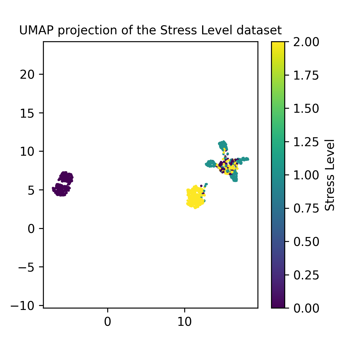
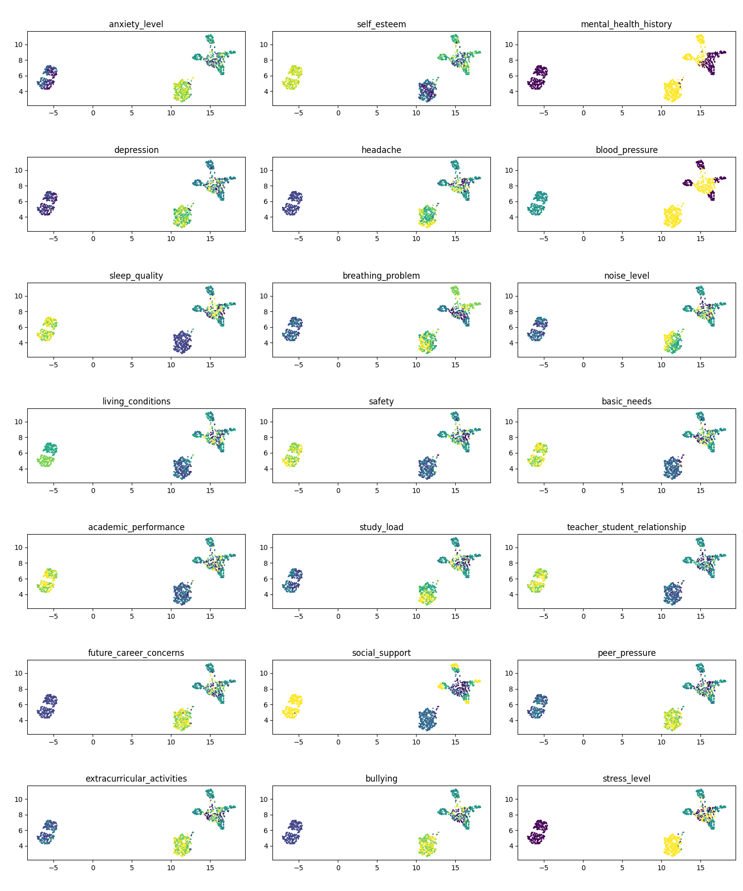
So the three groups seem to be separated by low/no stress (left group), high stress (lower right) and mixed (upper right). The smart thing to do would then to make a histogram of the fraction of each column contained in the three clusters, but that’s too much work at this point so I’ll just show each variable and we can formulate the reasons for why certain variables are causing the clusters to be separate/shaped as they are.
Some particularly interesting ones to me are: mental health history (1,3), blood pressure (2,3), breathing problems (3, 2), living conditions (4, 1), and social support (6, 2).

NOTE: We can theorise about why certain points are clustered as they are, but not about the distances between the sets per say. Just because one cluster is further away than another doesn’t mean it’s less similar.
You can actually imagine this situation with the figures above as an example. If we pick the 15 nearest neighbours to construct the graph, very few of the other points are going to have non-zero distances. So the position of them relative to each other will not be any different in terms of the weights whether they’re separated by 100 million units or in the case above ~5.
They’re nicely packed as they are due to the few small connections that do exist between the clusters (although grain of salt with this, as that’s really peaking more under the hood than I have so far).
3D UMAP Projection
(Below plots are all interactive, and annoyingly I couldn’t pick the initial camera position)
We can then also just look at these points in 3D by swapping the 2 for a 3.
import pandas as pd
import umap
from sklearn.preprocessing import StandardScaler
from matplotlib import pyplot as plt

stresslevel_data = pd.read_csv("StressLevelDataset.csv")


num_neighbors = 15 # Default value

reducer = umap.UMAP(n_components=3, n_neighbors=num_neighbors)

scaled_stresslevel_data = StandardScaler().fit_transform(stresslevel_data)

embedding = reducer.fit_transform(scaled_stresslevel_data)
And boom, basically the same graph but in 3D! In this case it doesn’t provide much more information but in more complex systems, you can imagine the closer the size to the original dimension the easier it’d be to reproduce the exact same distribution of points.
Now just picking out a few choice variables.
Conclusion
Hopefully in this post I’ve conveyed how simple yet cool UMAP is as a dimensionality reduction tool. Further extensions to UMAP exists that make it even more useful, for example Parametric-UMAP, which is a trained neural network that can construct a consistent low dimensional representation for a given input that you can use in a machine learning context to reduce over input volume for example.
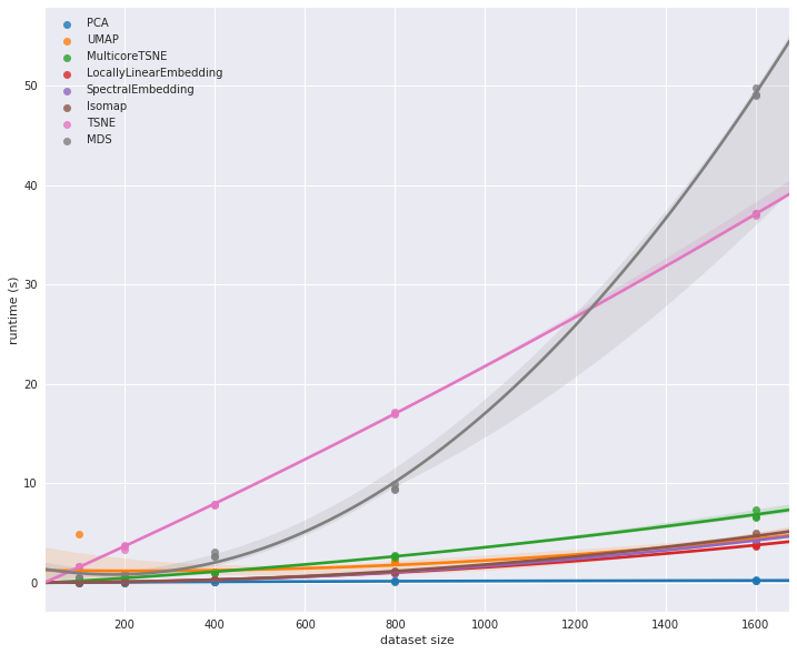
I leave you with a figure from the UMAP documentation comparing the computational complexity relationship for data size for various dimensional reduction algorithms.

I essentially showed this in my Flow Matching for image generation post in the conditional flow section where I generated MNIST-like images by simply giving the relevant numbers. ↩
In part because it shares a similar principle to flow-based density estimation approaches that wish to learn a projection from a simpler latent space into the data space. ↩
UMAP is ~\(\mathcal{O}(n^{1.14})\) compared to t-SNE which is \(\mathcal{O}(n^2)\) which can be very constraining in very high dimensional spaces among other aspects ↩
One of the main reasons I was initially interested in the approach was as a technique to learn a low dimensional summary statistic for use in SBI approaches. ↩
