Markov Chain Monte Carlo convergence diagnostics
Published:
In this post, I will detail popular diagnostic tests to quantify how well or if your MCMC sampling has converged.
Before I jump into the many wonderful and interesting different MCMC algorithms (e.g., Hamiltonian Monte Carlo or Gibbs sampling), I think it’s important to understand whether the algorithm has actually given you what you want, or whether it has converged at all in the first place.
And as usual, if you don’t like/understand the way I explain these concepts, it’s not because you’re too dumb; it’s probably just that my writing style doesn’t match your learning style. So, here are some other nice places to learn about these concepts.
- Convergence diagnostics for Markov chain Monte Carlo - Vivekananda Roy
- I use a couple of similar examples to this
- MCMC Diagnostics - Stephen Woodcock
- Good, but the sound quality is utterly atrocious
- Evaluating MCMC samplers - Bob Carpenter
- DATA ANALYSIS RECIPES:USING MARKOV CHAIN MONTE CARLO - David W. Hogg, and Daniel Foreman-Mackey
- Convergence tests for MCMC - Elan Sellentin
- Florida State University Bayesian Workshop - Applied Bayesian Analysis for the Social Sciences - Day 2: MCMC Convergence - Ryan Bakker
- Markov Chain Monte Carlo (MCMC) diagnostics by Marco Taboga
- Marco Taboga has a pretty in-depth website on statistics in general that I would recommend a read if you haven’t found it already
- Some Diagnostics for MCMC Simulation - Kevin Ross
- Autocorrelation: What It Is, How It Works, Tests - Tim Smith
- Monitoring (MCMC) Convergence - Roger D. Peng
Table of Contents
- Example MCMC Issues
- Traceplots - DO THIS ANYWAY—DO IIIIIT
- Running mean
- Effective Sample Size (ESS)
- Autocorrelation is not your friend
- Integrated Autocorrelation Time
- Gelman-Rubin - The dynamic duo
- Toy Models - You’ve got a friend
- Summary
- Next Steps
Example MCMC Issues
For as many questions as you are trying to solve with MCMC, there are many more problems with MCMC that you could face. In this post, I’m going to focus on 5 broad issues relating to MCMC algorithms, but I can tell you that many, many times I’ve gone down this road of diagnostics, and the real problem was that my question was ill-posed or I hadn’t actually set up the fundamental statistical method properly. So, absolutely go through these, but if you’re doing this because you’re getting incorrect results, you may want to just double check some base outputs first if you haven’t already.
I would also say that I use these more in practice to make my results more certain, i.e., a double check that I didn’t miraculously get a false positive result. Enough prologue though, what should we look out for?
- Convergence (duh)
- We would like to know that the samples that we are using for inference are actually samples from the target distribution and not some biased result because we didn’t let the algorithm run for long enough (spoiler: you’ll never truly know except for simple posteriors)
- Mixing (time)
- When statisticians refer to “good” or “bad” mixing when it comes to MCMC, they are more accurately referring to the mixing time of the Markov chain.
- This basically refers to how long/how many iterations it takes for the sampler to start properly sampling from the target distribution
- Or in a more fancy way, how long it takes for a chain to forget where it came from/become independent of its initialization
- Sample Independence
- As discussed in another post, by its very nature, MCMC produces autocorrelated samples, as each one is dependent on the last
- When we extract samples from the eventual result, we want to know that the samples we take out are approximately independent or independent enough
- Stability of estimates
- If I run the sampler with a different starting position, slightly different number of samples, etc., do I get similar results? Or do they fly out the window?
- Adequacy of the chosen burn-in period
- We want to maximise the number of accurate samples we produce, so we want to make the burn-in as small as possible without contaminating our results with non-representative samples
DISCLAIMER DISCLAIMER DISCLAIMER
Sometimes in this post, I may accidentally imply that these tests are exhaustive and will show problems if they arise. I try to show obvious problems and when you can see if that is the case, but this doesn’t mean at all that you can always tell that these metrics have actually told you that your MCMC has converged to the proper solution.
E.g., a simple example where none of these (or basically any other tests) will accurately tell you whether you’ve found the right answer or not is when the distribution of interest (posterior) may have two modes, one at \((0,0)\) and then another at \((10^{10}, 10^{10})\) with variance ~1. It should be obvious in this situation that due to a number of reasons, if MCMC finds one, it’s absolutely not guaranteed to find the other unless you have prior knowledge of the locations.
For this reason, it is better to think of these tests as something that may tell you something has gone wrong, in which case you can then fix it. But not that things have gone right. But to show how they work, I emphasize when the plots show what they’re meant to show and hence may have led to some confusion.
Traceplots
Traceplots, as in the name, simply trace the progression of a chain in your MCMC algorithm. For example, let’s cook up a very basic example where we sample a 1D distribution of two normal distributions stacked on top of each other.
I am using the python package emcee to do the sampling that uses Affine-Invariant Ensemble Sampling where you initialise multiple chains, often called ‘walkers’, that proposes new samples not only based on its current position but the positions of the other walkers. For this post you can just think of it as Metropolis-Hastings where the chains talk to each to propose more useful proposal samples1.
import numpy as np
import emcee

def log_prob(x, ivar):
    return np.logaddexp(-0.5 * np.sum((x-1) ** 2/ivar**2), -0.5 * np.sum((x+1) ** 2/ivar**2))

ndim, nwalkers = 1, 10
ivar = np.random.rand(ndim)
p0 = np.random.randn(nwalkers, ndim)
print(p0.shape)
p0 = np.random.normal(loc=np.zeros((ndim,)), scale = np.ones((ndim,)), size=(nwalkers, ndim))
print(p0.shape)


sampler = emcee.EnsembleSampler(nwalkers, ndim, log_prob, args=[ivar])
sampler_results = sampler.run_mcmc(p0, 10000)
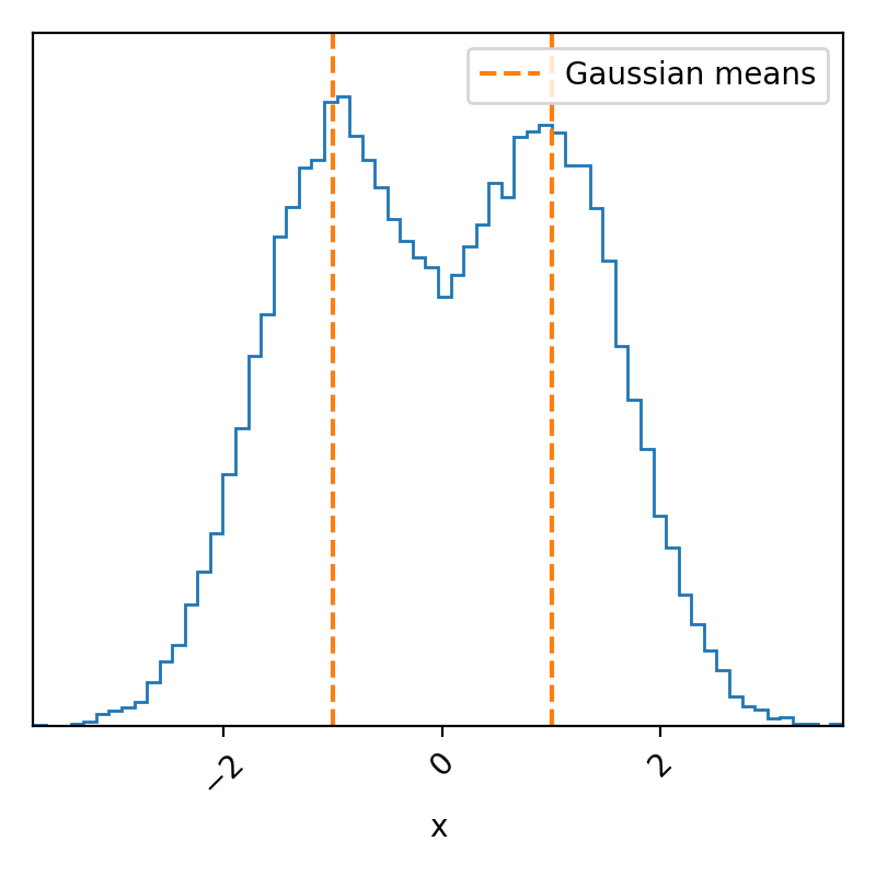
Just as promised, a simple bimodal probability density distribution. Because we know exactly what we put in, we know that these samples match what we expected, but we basically never know the exact form of our posterior density; otherwise, why are we using MCMC? So if we didn’t know if this was what this was meant to look like, we could try and figure out if the sampler seems to have not converged. We can possibly do this by analyzing the trace.
I’m using the ArviZ python package to do this analysis.
import arviz as az
idata = az.from_emcee(sampler, var_names=[''])


# Plot the trace of the samples
ax = az.plot_trace(idata, figsize=(15,5))
ax = np.array(ax).flatten()
ax[0].set_xlabel("x", size=18)
ax[1].set_xlabel("iterations", size=18)
plt.tight_layout()
plt.savefig("converged_bimodal_trace_plot.png")
plt.show()
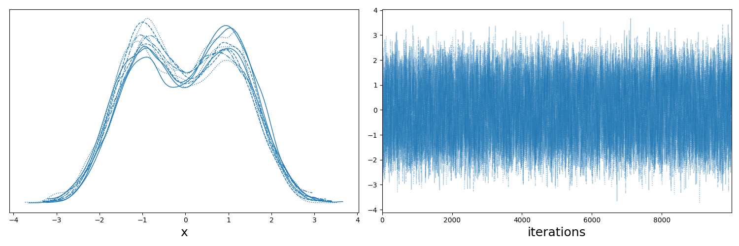
The key takeaways here are:
- if you look at the left plot, which shows the sample distributions for each of the chains/walkers, that they all look roughly the same,
- if you look at the right plot, which shows the positions of the chains as a function of the iteration number of the sampler, that they are centred about the same values
I then wanted to show what a very obviously unconverged trace looks like but it kept doing it so quickly that I couldn’t really show the problematic behaviour properly. So I’m going to re-use a slightly different implementation of the Metropolis-Hastings algorithm that I used in a previous post that I’ve put in the drop-down below, but you can skip that as it’s not the important bit.
Metropolis-Hastings code
import numpy as np
import scipy.stats as stats

# Metropolis-Hastings Sampler
def metropolis_hastings(target_pdf, proposal_sampler, proposal_logpdf, num_samples=5000, x_init=1.0):
    samples = [x_init]
    x = x_init
    accept_count = 0

    for _ in range(num_samples):
        x_prime = proposal_sampler(x)  # Propose a new sample
        if x_prime <= 0:  # Ensure positivity for Gamma distribution
            continue

        # Compute acceptance ratio
        p_accept = np.exp((target_logpdf(x_prime) - target_logpdf(x)) + (proposal_logpdf(x, scale=x_prime)-proposal_logpdf(x_prime, scale=x)))
        p_accept = min(1, p_accept)

        if np.random.rand() < p_accept:
            x = x_prime
            accept_count += 1

        samples.append(x)

    return np.array(samples), accept_count / num_samples  # Return samples and acceptance rate

# Symmetric Proposal: Normal Distribution centered at x
def symmetric_proposal_sampler(x, sigma=0.1):
    return np.random.normal(loc=x, scale=sigma)


def symmetric_proposal_logpdf(x, sigma=0.1, scale = 1):
    return stats.norm.logpdf(x, scale=sigma, loc=scale)
import numpy as np
import scipy.stats as stats

def target_logpdf(x):
    ivar = 1/10
    return (np.logaddexp(-0.5 * np.sum((x-100) ** 2/ivar**2), -0.5 * np.sum((x+100) ** 2/ivar**2)))


num_samples = 10000

symmetric_samples, sym_accept_rate = metropolis_hastings(
    target_logpdf,
    lambda x: symmetric_proposal_sampler(x, sigma=0.01),
    lambda x, scale: symmetric_proposal_logpdf(x, sigma=0.01, scale=scale),
    num_samples=num_samples,
    x_init=20,

)
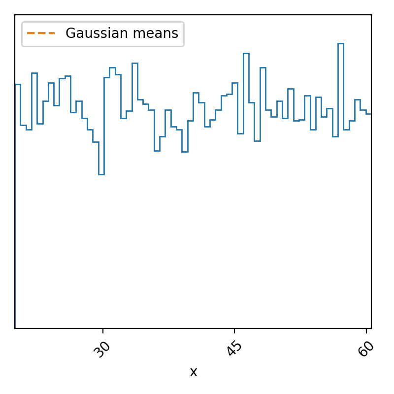
So, I’ve increased the distance between the peaks, made it so that the proposal sampler was fairly narrowed, meaning that it’s pretty slow to explore the parameter space, and made the initialization pretty far away from either of the modes, which has left us with the above. But if we didn’t know the form of our posterior, we may think that maybe our data was completely uninformative on our data and the posterior would subsequently be uniform and we’d get the above. However, if we look at the trace we’ll see that this is definitely not the case.
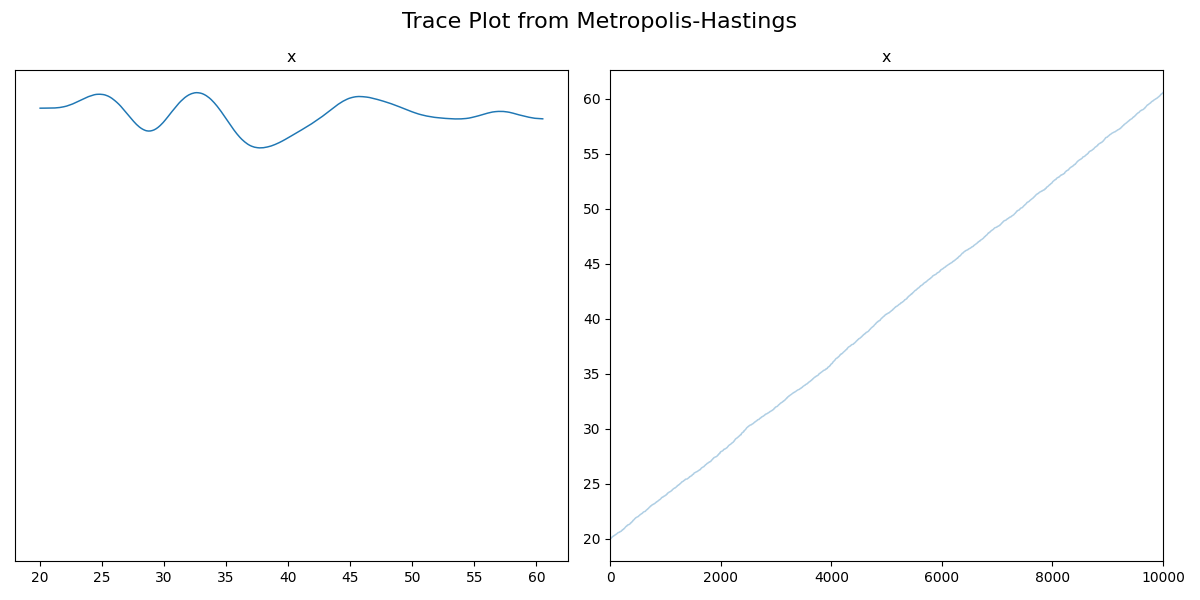
So unfortunately, I had to switch to a non-ensembler sampler so we can’t use the left plot for much, but the right is extremely informative. If the distribution was in fact uniform within two bounds, then we would expect the trace to show fluctuations within those bounds, but what we have is the sample values seem to be increasing at every iteration, i.e., they haven’t started fluctuating about a single set of values (e.g. like the two gaussian centres in the traceplot above), so it hasn’t converged2. This would indicate that either we should broaden our proposal distribution and/or run the code for longer (in practice the proposal distribution is handled by the given package, though). If we do both of these, we find the following.
Code
num_samples = 20000

symmetric_samples, sym_accept_rate = metropolis_hastings(
    target_logpdf,
    lambda x: symmetric_proposal_sampler(x, sigma=1),
    lambda x, scale: symmetric_proposal_logpdf(x, sigma=1, scale=scale),
    num_samples=num_samples,
    x_init=20,

)
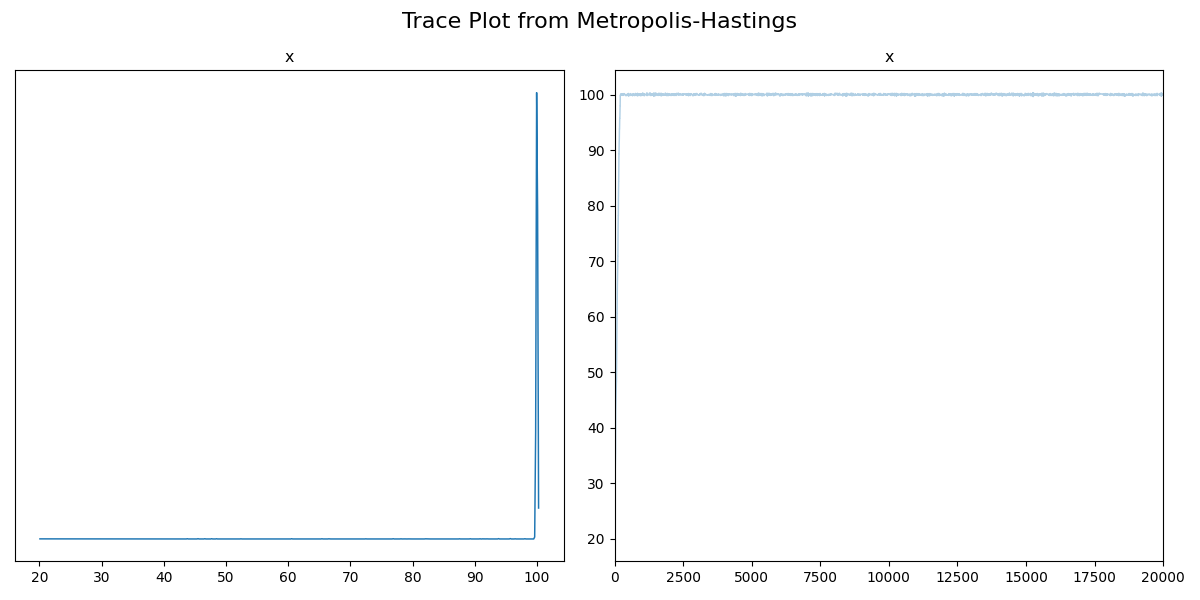
You can see that the sampler seems to converge much faster, and that the samples eventually start fluctuating about one point. I’ll get rid of the burn-in samples so that this is easier to see.
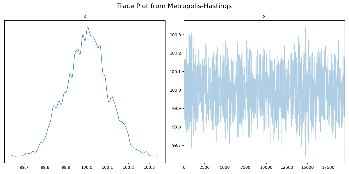
Now this looks pretty good, but, we know that the posterior should be centred about two values. Just from the trace, we’re not able to see anything wrong, so keep this in mind if you usually use the trace diagnostic.
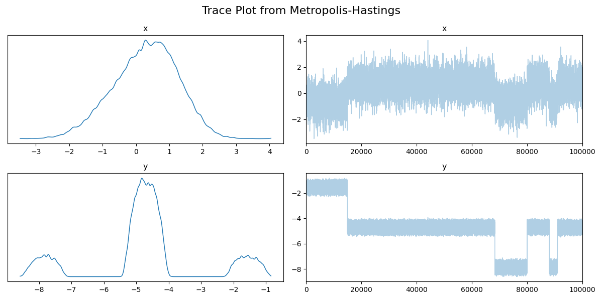
And here’s an example of a more typical case where the trace hasn’t converged. I’ll go through the full example with another diagnostic.
Running mean / statistical moment
A distribution as a whole always has a single mean; it might have multiple modes, but it will always have a single mean. What we do with a running mean is further use the traceplots described above, but, as in the name, take a running mean of the samples. If your sampler has converged, then this mean should start to converge on a single value3. That’s it! Let’s look at a couple of examples.
Let’s look at the trace of the nice example of the two gaussians first.

We can modify the samples from this to take a running mean like so.
import arviz as az
idata = az.from_dict(posterior={"": [np.mean(samples[:i]) for i in range(1, len(samples))]})


# Plot the trace of the samples
ax = az.plot_trace(idata, figsize=(15,5))
ax = np.array(ax).flatten()
ax[0].set_xlabel("running mean", size=18)
ax[1].set_xlabel("iterations", size=18)
plt.tight_layout()
plt.savefig("converged_bimodal_running_mean_plot.png")
plt.show()
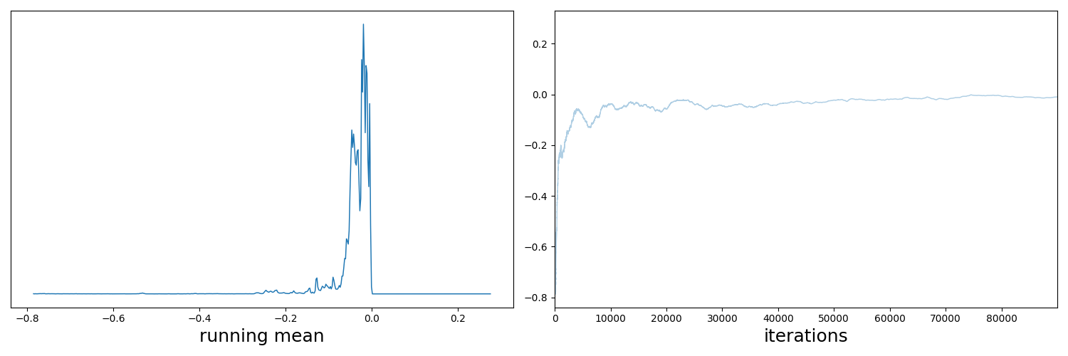
So this is the expected behaviour, but now let’s go back to that messed up example I hinted at before. The mathematical definition for the density is,
\[\begin{align} p(x, y) = \exp\left(-\frac{x^2}{2}\right)\exp\left(-\frac{-(csc(y)^5-x)^2}{2}\right) +10^{-10}, \quad\quad \forall x, y \in [-10, 10]. \end{align}\]The \(10^{-10}\) is because I was getting numerical instability issues. For reference, this is what the density is meant to look like.
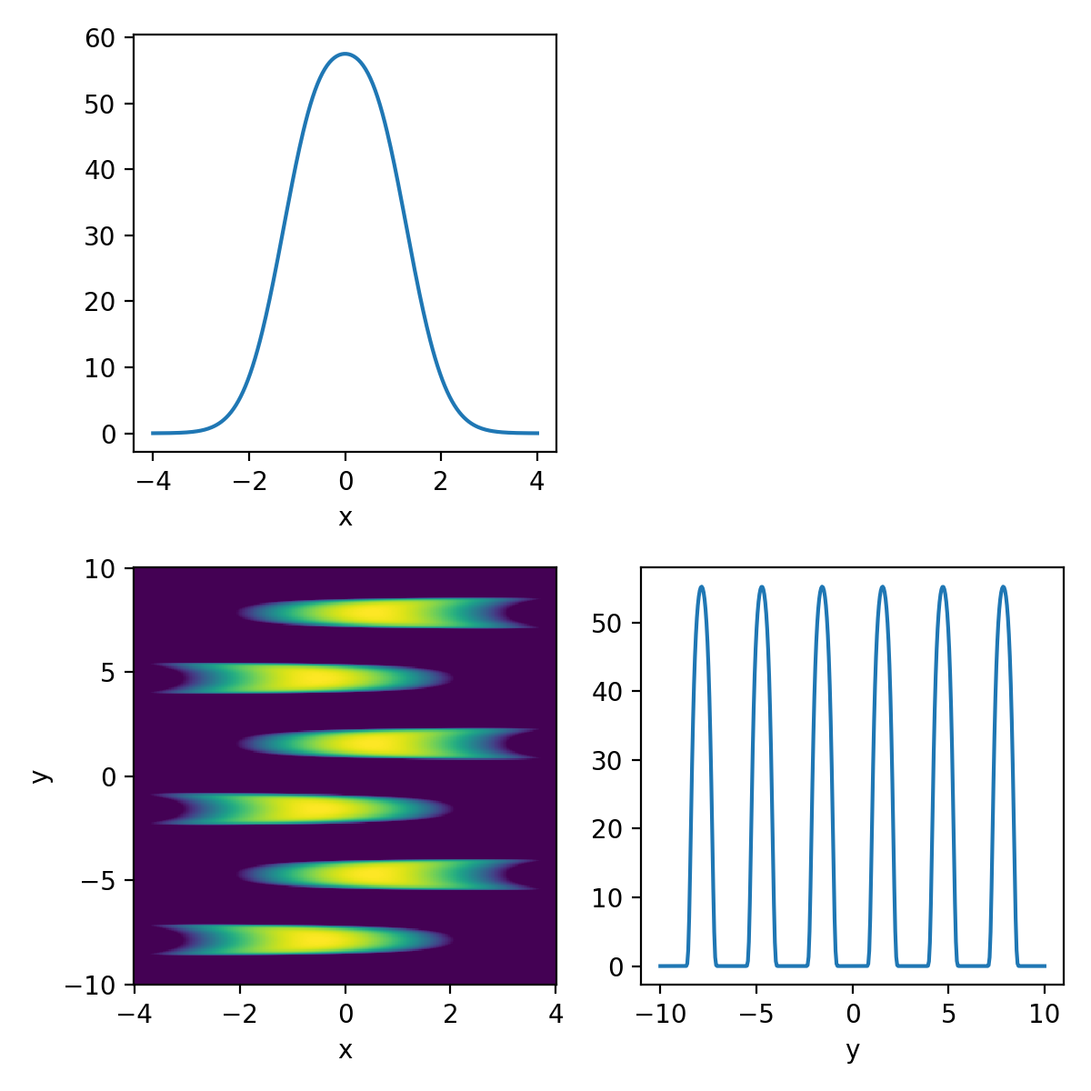
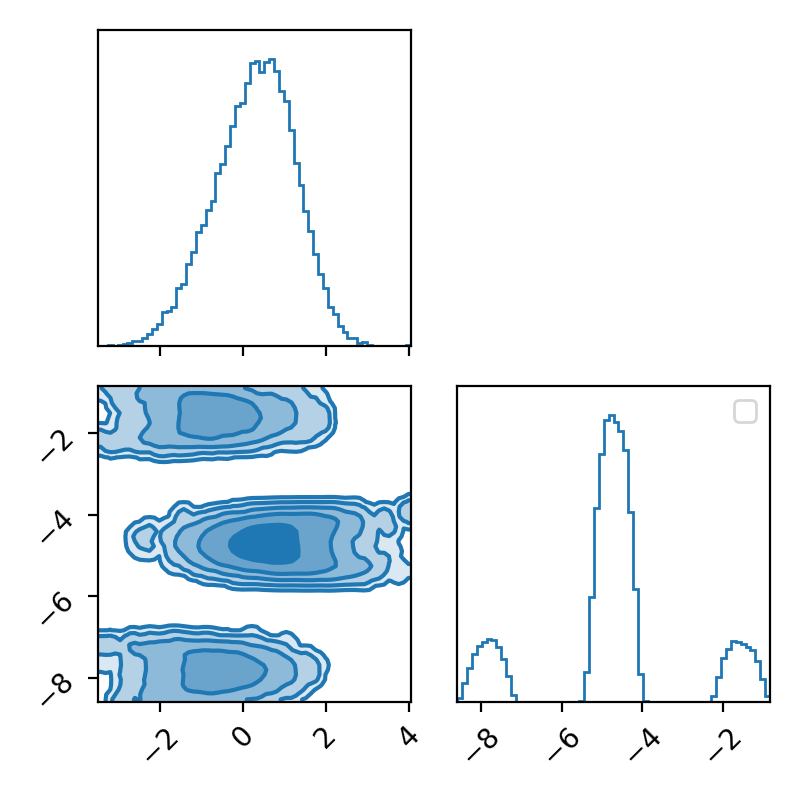
Now I’ll throw my Metropolis-Hastings sampler at it and look at the corner plot of the samples.
Then the trace.

And now the running mean.
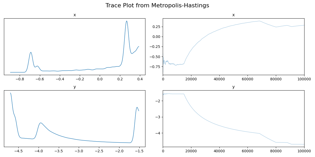
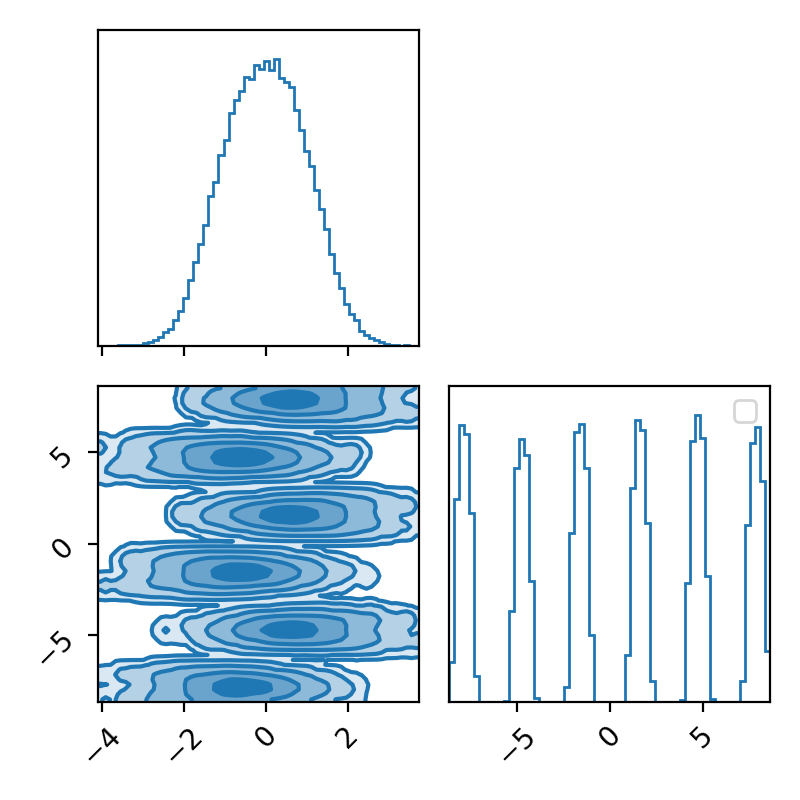
Now if we didn’t know exactly what this density looked like, maybe we could convince ourselves that the corner plot looked alright. The trace plot then indicated that maybe it didn’t fully converge, and now the running means really show that the average hasn’t converged. If I let the algorithm go for longer, I can then show what this was meant to look like4 for this density.
The corner.
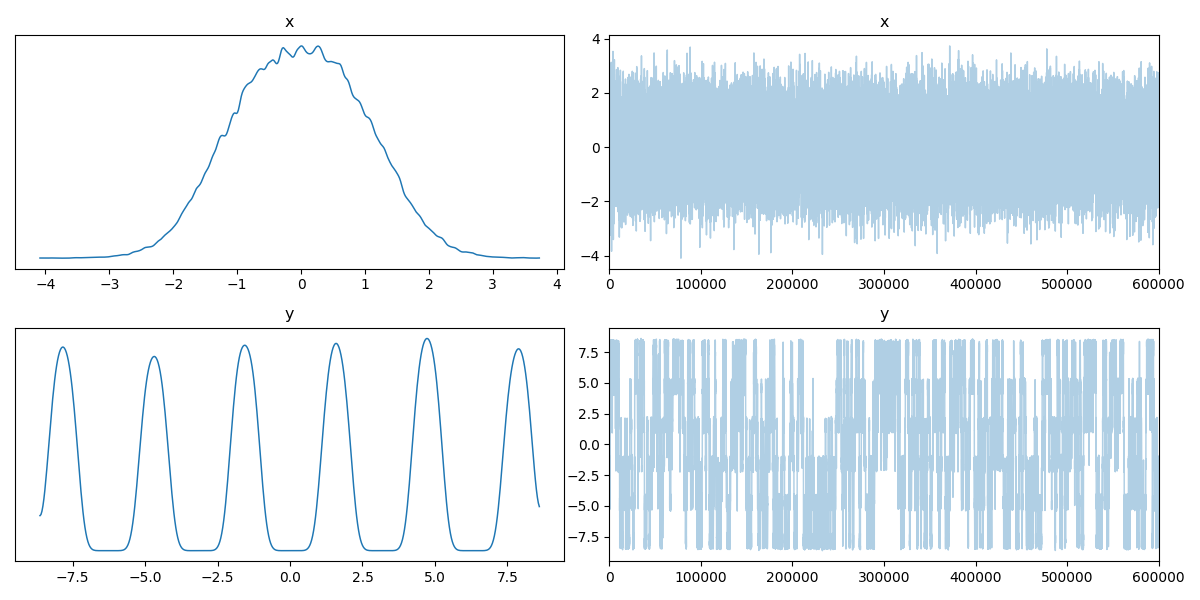
The trace.
And the running mean.
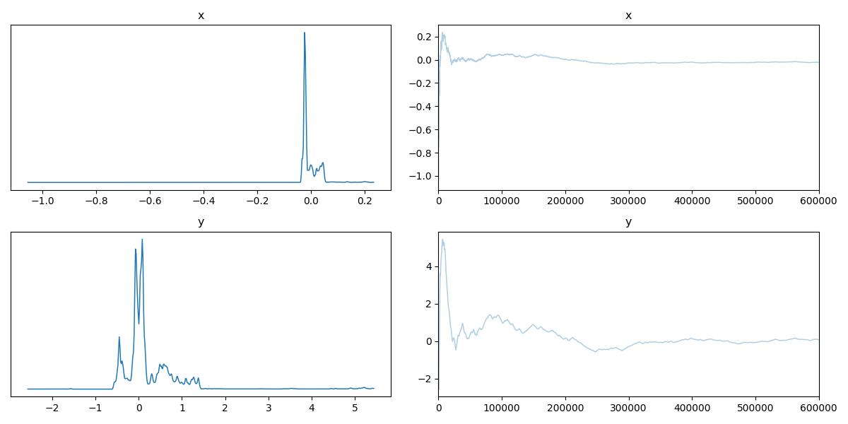
Now we can see by comparing the corner plot to the plot I calculated directly, that this MCMC seems to have pretty much converged. From the trace this might not be clear, seeing as the y variable seems to be switching between modes, so it’s hard to tell if it’s actually centring around modes or mode switching (similar to label switching). However, with the running mean, you can see that we have converged to a singular value, despite the multi-modality of the problem!
Another key thing to note here is that I’ve done this for the mean, but you could just as well do this for many other statistical measures, e.g., running variance, or the running mean of any function of your samples that outputs a singular value.
Autocorrelation is not your friend
MCMC samples are autocorrelated5, but how autocorrelated are they? If not a lot, then great! If quite a lot, not great. Here we detail quantitative ways to estimate how autocorrelated samples from a sampler’s chains are.
Autocorrelation in simple terms is how related a variable’s current value is with its past values.
The calculation of autocorrelation is nicely expressed as a combination of the autocovariance and variance.
In case it’s been a while since you looked at the formula for covariance, here it is again.
\[\begin{align} \text{cov}(X, Y) = \frac{1}{n} \sum_{i=1}^n (x_i - \mathbb{E}(X))(y_i - \mathbb{E}(Y)) \end{align}\]Where \(n\) is the number of datapoints; in our case, this will specifically be the number of samples. The autocovariance with a lag of \(k\) is then,
\[\begin{align} \rho_k = \frac{1}{n} \sum_{i=k+1}^n (x_i - \mathbb{E}(X))(x_{\left(i-k \right)} - \mathbb{E}(X)), \end{align}\]when \(k=0\) then you just get the variance, \(\text{Var}(X)\). And then finally we get to the autocorrelation with lag \(k\),
\[\begin{align} \gamma_k = \frac{\rho_k}{\rho_0}. \end{align}\]From this, we can see that the magnitude of autocorrelation is less than or equal to 1. The top has to be less than the bottom. Autocorrelation isn’t specific to MCMC but has a wide range of applications, particularly in signal processing (so I apologize for those in the field if I don’t describe all this at 100%). Just to give as much of an intuitive feel to this as possible, we’ll look at maximal and minimal examples of autocorrelation.
Starting with the minimal, 0 autocorrelation relates to completely random values or independent samples (our goal with the MCMC samples). If I generate random samples from a normal distribution (i.e., each sample is independent from the next), then with enough samples we should see the values approach 0 (as you can see in the GIF below).
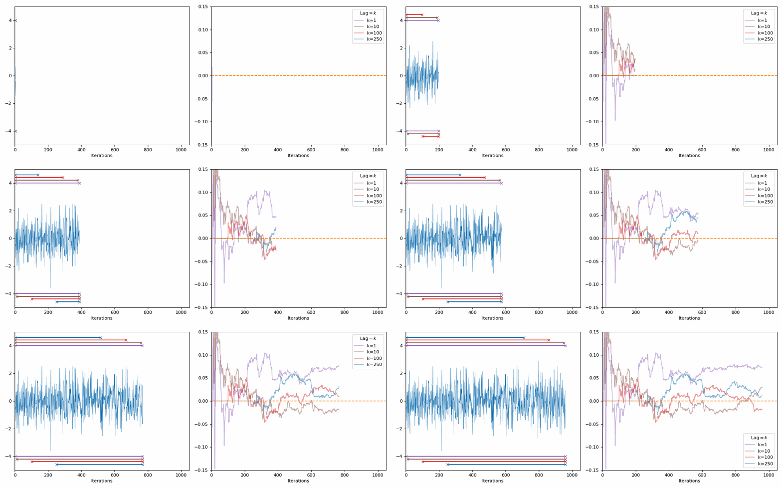
The lines in the gif show the range of samples that are used for the calculation for the different lags on the right. Different lags look for behaviours over shorter ranges for shorter lags, and larger ranges for larger lags. When analyzing MCMC samples, we generally prioritize shorter lags, as if we presume that the “good” chains have found the target density and are approximately independent (“well mixed”), the autocorrelation should decline rapidly. However, long lags may tell you about long-term behaviour, such as getting trapped in certain areas of the parameter space.
The best thing to do is similar to the above: look at the autocorrelation for multiple lag values.
Integrated Autocorrelation Time
When investigating autocorrelation in the previous section, we specifically looked at what the correlation between samples in a chain look like at various lags. The integrated autocorrelation time is denoted,
\[\begin{align} \tau_{\text{int}} = 1 + 2 \sum_{k=1}^{\infty} R(k) \end{align}\]To show what this says about the MCMC chains we’ll show how the variance of the sample average, \(Var(\bar{X})\), is related to \(\tau_{\text{int}}\).
The sample variance is calculated by,
\[\begin{align} Var(\bar{X}) &= Var\left(\frac{1}{N} \sum_{i=1}^N X_i \right) \\ &= Var\left(\frac{1}{N} \sum_{i=1}^N X_i \right) \\ &= \frac{1}{N^2} \sum_{i=1}^N \sum_{j=1}^N Cov(X_i, X_j) \\ \end{align}\]Now if we assume that we’ve hit the stationary distribution, then the covariance between any two samples is just a function of the lag,
\[\begin{align} \gamma_k = Cov(X_i, X_{i+k}) = Cov(X_j, X_{j+k}). \end{align}\]Defining \(\gamma_k\) for the covariance for lag \(k\) (i.e. the autocovariance with lag \(k\)) that has the following properties;
- \(\gamma_k\) \(=\) \(\gamma_{-k}\)
- \(\gamma_0\) \(=\) \(Var(X)\)
This allows us to simplify the \(\bar{X}\) variance into,
\[\begin{align} Var(\bar{X}) &= \frac{1}{N^2} \sum_{i=1}^N \sum_{j=1}^N Cov(X_i, X_j) \\ &= \frac{1}{N^2} \left[N\gamma_0 + 2\sum_{k=1}^{N-1} (N-k)\gamma_k \right] \\ \end{align}\]Which without a tangent into combinatorics, I’ll just show you the above is true in the case of \(N=4\).
\[\begin{align} Var(\bar{X}) &= \frac{1}{4^2} \sum_{i=1}^4 \sum_{j=1}^4 Cov(X_i, X_j) \\ 4^2 Var(\bar{X}) &= \sum_{i=1}^4 Cov(X_i, X_1) + Cov(X_i, X_2) + Cov(X_i, X_3) + Cov(X_i, X_4) \\ &= Cov(X_1, X_1) + Cov(X_1, X_2) + Cov(X_1, X_3) + Cov(X_1, X_4) \\ & \quad + Cov(X_2, X_1) + Cov(X_2, X_2) + Cov(X_2, X_3) + Cov(X_2, X_4) \\ & \quad + Cov(X_3, X_1) + Cov(X_3, X_2) + Cov(X_3, X_3) + Cov(X_3, X_4) \\ & \quad + Cov(X_4, X_1) + Cov(X_4, X_2) + Cov(X_4, X_3) + Cov(X_4, X_4) \\ &= \gamma_0 + \gamma_1 + \gamma_2 + \gamma_3 \\ & \quad + \gamma_1 + \gamma_0 + \gamma_1 + \gamma_2 \\ & \quad + \gamma_2 + \gamma_1 + \gamma_0 + \gamma_1 \\ & \quad + \gamma_3 + \gamma_2 + \gamma_1 + \gamma_0 \\ &= 4 \gamma_0 + 6 \gamma_1 + 4\gamma_2 + 2\gamma_3 \\ Var(\bar{X}) &= \frac{1}{4^2} \left(4\gamma_0 + 2(4-1)\gamma_1 + 2(4-2)\gamma_2 + 2(4-3)\gamma_3 \right) \\ &= \frac{1}{N^2} \left(N\gamma_0 + 2\sum_{k=1}^{N=4} (N-k)\gamma_k \right) \\ \end{align}\]Further expanding the variance of the average,
\[\begin{align} Var(\bar{X}) &= \frac{1}{N} \left[\rho_0\gamma_0 + 2\sum_{k=1}^{N-1} (1-k/N)\rho_k\gamma_0 \right] \\ &= \frac{\gamma_0}{N} \left[1 + 2\sum_{k=1}^{N-1} (1-k/N)\rho_k \right] \\ \end{align}\]And again presuming that we’ve hit the staionary distribution then we take the limit as large \(N\) then \(k/N\approx0\) and,
\[\begin{align} Var(\bar{X}) &= \lim_{N\rightarrow\infty} \frac{\gamma_0}{N} \left[1 + 2\sum_{k=1}^{N-1} (1-k/N)\rho_k \right] \\ &\approx \frac{Var(X)}{N} \left[1 + 2\sum_{k=1}^{\infty}\rho_k \right] \\ &\approx \frac{Var(X)}{N} \tau_\text{int} \\ \end{align}\]Then we note that for independent and identically distributed samples \(X\) you would expect that,
\[\begin{align} Var(\bar{X}) &\approx \frac{Var(X)}{N}. \\ \end{align}\]So \(\tau_\text{int}\) quantifies the inflation of the variance due to inefficiencies. A smaller $\tau_{\text{int}}$ means better mixing and less dependence between samples.
For the above unconverged and converged examples this is how the Integrated Autocorrelation Time progresses.
Unconverged
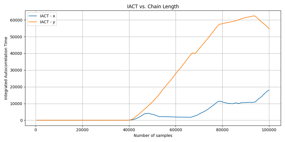
For the unconverged IACT you can see that the value increases after around the 40,000th iteration which is strange and additionally when the MCMC algorithm finishes the IACT value is not close to being small, indicating that the algorithm hadn’t converged.
Converged
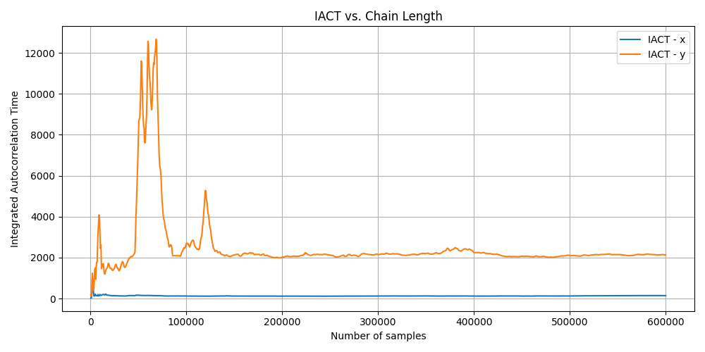
For the (seemingly) converged MCMC algorithm, you can see that the IACT drops over time but the IACT for the Y is quite large, meaning that it takes a much longer time to generate independent samples but has stabilised. While X is much, much smaller, meaning that it takes much less time to get independent samples. This matches the complexity of the respective marginals.
Effective Sampling Size
If we had independent and identically distributed samples then you would expect \(Var(\bar{X}) \approx \frac{Var(X)}{N}\), however we’ve just derived \(Var(\bar{X}) = \frac{Var(X)}{N}\tau_\text{int}\) in the above section. By a simple rearrangement then,
\[\begin{align} N_{eff} = \frac{N}{\tau_\text{int}}. \end{align}\]So the Effective Sample Size $N_{eff}$ represents the approximate number of effective independent samples at a given iteration. And due to it being a simple rearrangement of the integrated autocorrelation time, we can make a similar set of plots.
Unconverged
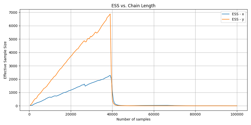
For the unconverged ESS graph you can see that the value randomly drops after around the 40,000th iteration which is strange and additionally when the MCMC algorithm finishes the ESS value is extremely small saying that we have \(\leq1000\) samples.
Converged
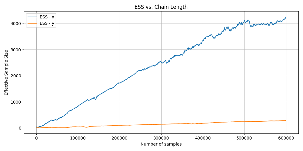
For the converged MCMC algorithm you can see that the ESS increases over time for both variables but more slowly for Y, again matching the complexity of the marginals.
Toy modelling - You’ve got a friend
One of the key skills that I’ve developed as a statistician/physicist is being able to create representative values of how I believe the data is generated so that I have a clean dataset to test my framework on. I would do an example of this but it’s in pretty much every single post I make, but I’m particularly proud of the one I made for the normalising flows post.
Summary
AAnd one final note. I’ve tried to show that all of these methods are incomplete; they show you some things but not others, per se. So, when doing any kind of diagnostics, more is better. This includes diagnostics but also just the number of samples. If you are unsure of whether a sampler has converged, just run it for longer if you can. And a particular key note, I haven’t coverged the most common metric the Gelman-Rubin statistic simply because I didn’t have enough time while writing this. I’d recommend this letter/paper Revisiting the Gelman-Rubin Diagnostic Simulations by Dootika Vats and Christina Knudson.
And keep in mind that even if you do all this is doesn’t mean that your MCMC has 100% converged to the right answer, just that it hasn’t converged to the wrong answers that would show up in these kind of plots. If you could conclude that your MCMC has converged on the right answer, then you must know in some way what the right answer should be beforehand, which questions why you’re doing the MCMC in the first place?
Next Steps
In the future I’ll try and detail some more commonly used “pure” MCMC methods including Hamiltonian Monte Carlo, Gibbs Sampling, Metropolis-Adjusted Langevin Algorithm and Slice Sampling.
Future Me Note (07/10/2025): I in fact likely will not get to many of these within the forseeable future due to my work in Variational Inference methods of which I have quite a few posts on now. So this post will likely be the last one in my kind of introductory series to Bayesian analysis.
Future Me Note (09/02/2026): I in fact did get to all of these methods and they should be included in my posts and on the ‘Next Post’ link.
One thing to note here is that I’m using a small number of walkers so later plots are easier to look at, but in practice you should be using more if you can. ↩
With some exceptions such as Hamiltonian Markov Chain Monte Carlo being mostly converged but the walkers are just within a particular area of the energy contours and seemingly continuously changing values and not fluctuating about a given value. So from the above rule of thumb it seems like it hasn’t converged, when it has actually has. ↩
Except as stated in the disclaimer we can never truly know if we don’t know what the answers should be apriori. ↩
I had to fine tune the parameters to get something reasonably bad but not outright horrible for these demonstrations. The most common way that you will get pathological posteriors/target densities is through high dimensionality, but as I show above this doesn’t mean you can’t get them in low dimensions. ↩
“Autocorrelation” might sound a bit strange if you are unfamiliar. The difference between “correlation” and “autocorrelation” is that correlation refers to the dependencies between two separate variables and autocorrelation refers to dependencies of data to itself. ↩
