First Blog Post/Fitting a line I
Published:
First blog post, outlining what I’m going to try and do in the next few posts and some basics of Bayesian analysis.
Table of Contents
Statistics is cool trust me
My research interests are in astro-particle physics. This involves a lot of data, models, and parameters. Extracting meaningful information from all of that requires careful and thoughtful analysis.
Due to this, I frequently (always) use Bayesian methods. In my first few posts, or however long it takes, I hope to show why this is.
Like many a statistics blogger, I’m going to make this post pretty similar to Dan Foreman Mackey’s, and I am particularly further influenced by Andy Casey’s teaching; the relevant posts can be found here (unless it’s bad, then he had nothing to do with it). One key difference between what I’m going to do and Dr. Casey’s website is that I’m going to skip the analytical methods at the beginning, as I personally rarely use those methods in my work and figure that this is my blog, so I’m going to show what I do.
I’m not sure what your background is, so I’ll try to start from as basic a level as I can. That said, I know I sometimes get a bit locked into my own way of thinking—so if anything here is unclear or could be better explained, please shoot me an email!
Fitting a line to data. (Gotta start somewhere)
For this post, I’m going to throw some data at you. It might seem simple but will provide some of the ground rules for following posts.
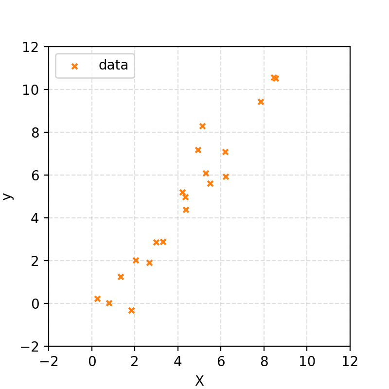
I’ve generated some random x values, then created corresponding y values using the equation for a straight line and added noise drawn from a Gaussian distribution. In notation:
\[X \sim \mathcal{U}(0,10)\] \[y \sim \mathcal{N}(\mu=m\cdot X+ c, \sigma^2=1).\](The first line says that X is uniformly distributed between 0 and 10. The second says that y is normally distributed around the straight line \(m · X + c\) with a standard deviation of 1.)
I won’t tell you what \(m\) and \(c\) are; that is what we’re trying to find. But let’s say that we, for some reason, know that \(m\) will be between \(0\) and \(10\) and \(c\) will be between \(-10\) and \(10\).
This gave me some data that looks like the following.
Let’s start with exploration
First, let’s define a function to use for our straight line.
def line_function(x, m, c):
    return m * x + c
The first thing that you may want to do is guess. There’s nothing explicitly wrong with this; it may give you an idea of your parameters and is part of normal exploratory analysis where you get a feel for the data. For the following I got the \(m\) and \(c\) values by gradually changing them by eye.
# Instantiation some x values to use with our straight line
x_example = np.linspace(-2, 12)
# y values based on function and guessed parameters
y_guess = line_function(x_example, m=1.3 , c=-0.8)


fig, ax = plt.subplots(1, 1, figsize=(4, 4), dpi=200)

# Plotting actual data
plt.scatter(X_true, y, s=15, marker='x', c='tab:orange', label="data")

# Plotting guesstimates
plt.plot(x_example, y_guess, c="tab:green", label="guess")

ax.set_xlim(-2, 12)
ax.set_ylim(-2, 12)

ax.set_xlabel("x")
ax.set_ylabel("y")

ax.legend()
plt.show()
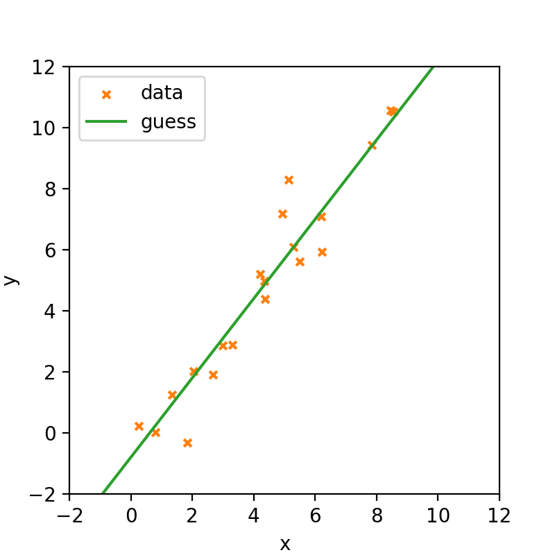
When trying this out in practice you can be quite surprised at how close you get to the true values. Unfortunately, guesstimation won’t make it into a paper!
Let’s start with a simple, albeit often flawed, approach
We need some sort of function to get a probabilistic interpretation of our parameters. For that, we will mimic how I generated the data, particularly the probability to generate the data for a given set of input parameters, otherwise known as the likelihood.
Through Maths
\[\begin{align} \mathcal{L}(\vec{y}|\vec{x}, m, c, \sigma) &= \prod_{i} \mathcal{L}(y_i|x_i, m, c, \sigma) \\ &= \prod_{i} \frac{1}{\sqrt{2\pi\sigma^2}} exp\left(-\frac{(y-f(x, m, c))^2}{2\sigma^2}\right) \end{align}\]The probability that this value came from a line with gradient \(m\) and intercept \(c\) is described by a normal distribution which is an extremely common assumption (due to something called the Central Limit Theorem and other magical things about normal distributions). The probability (density) that the whole dataset comes from the line is just the product of all the individual probabilities.
In a simpler case you can ask what the probability of getting three heads in a row is when flipping a coin. Presuming that the coin is fair, then the probability of heads at each flip is 50% or \(0.5\). The probability of getting three in a row is then \(0.5\cdot0.5\cdot0.5 = 0.125\). This is exactly what’s happening here, but instead of a simple 50/50 coin toss, we’re dealing with a more complex probability distribution.
In essence, the likelihood function tells us how likely it is to observe our data given specific parameters of the model. For this example, the likelihood assumes that each data point is drawn from a normal distribution centered on the line defined by \(m\) and \(c\).
Through Code
def ln_likelihood(d, theta, sigma=1):
    y, x = d
    m, c = theta
    ln_like = -(y[:, np.newaxis]-line_function(x[:, np.newaxis], m[np.newaxis, :], c[np.newaxis, :]))**2/(2*sigma**2) - np.log(np.sqrt(2*np.pi)*sigma)
    return ln_like.sum(axis=0)
(We take the log value to avoid issues of numerical instability)
The basic (and often very bad) thing to do is then to just brute force possible combinations of \(m\) and \(c\) using those assumptions we stated at the beginning.
# Create a grid of parameter values (m, c) to evaluate likelihood
m_values = np.linspace(0, 10, 101)
c_values = np.linspace(-10, 10, 101)

m_mesh, c_mesh = np.meshgrid(m_values, c_values, indexing='ij')

log_likelihood_values = ln_likelihood((y, X_true), (m_mesh.flatten(), c_mesh.flatten()), sigma=1).reshape(m_mesh.shape)
# Plot
plt.figure()
plt.pcolormesh(m_values, c_values, np.exp(log_likelihood_values).T, shading='auto', cmap='viridis')
plt.xlabel("m")
plt.ylabel("c")
plt.legend()
plt.show()
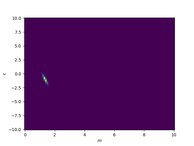
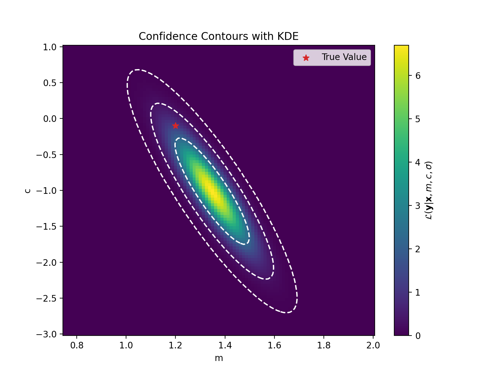
We can see that there is a particular region where the likelihood values are larger (notice I’m not saying probability). Let’s zoom in to that. We’ll also fit a Gaussian (KDE) to these values to get contour curves and directly plot the likelihood values and sneak in the true values for the parameters.
# Flatten grid and normalize likelihood
data_points = np.vstack([m_mesh.flatten(), c_mesh.flatten()])
likelihood = np.exp(log_likelihood_values.flatten())
weights = likelihood / np.sum(likelihood)

# Apply Gaussian KDE with weights
kde = stats.gaussian_kde(data_points, weights=weights)

# Evaluate KDE on the grid
pdf_values = kde(np.vstack([m_mesh.ravel(), c_mesh.ravel()])).reshape(m_mesh.shape)

# Define confidence levels (e.g., 1σ, 2σ, ...)
sorted_pdf = np.sort(pdf_values.ravel())[::-1]
cumulative = np.cumsum(sorted_pdf) / np.sum(sorted_pdf)
confidence_levels = [sorted_pdf[np.searchsorted(cumulative, level)] for level in [norm.cdf(val)-norm.cdf(-val) for val in range(1,4)]]  # 1σ, 2σ, 3σ

confidence_levels = np.sort(confidence_levels)

# Plot
plt.figure()
plt.pcolormesh(m_values, c_values, pdf_values.T, shading='auto', cmap='viridis')
plt.colorbar(label=r'$\mathcal{L}(\mathbf{y}|\mathbf{x}, m, c, \sigma)$')
plt.contour(m_values, c_values, pdf_values.T, levels=confidence_levels, colors='white', linestyles='--', linewidths=1.5)
plt.scatter([m_true], [c_true], c='tab:red', marker='*', label='True Value', s=50)
plt.xlabel("m")
plt.ylabel("c")
plt.legend()
plt.show()
Bayes’ Theorem
Now these aren’t strictly probability values on \(m\) and \(c\). What we have evaluated is the probability of the data points given the parameters.
In essence,
\[p(y\mid x, m, c, \sigma)\]but what we want is
\[p(m,c\mid x,y,\sigma).\]We can convert \(p(y\mid x, m, c, \sigma)\) to the probability density on the parameters using Bayes’ theorem. Generally,
\[p(\vec{\theta}\mid\vec{d}) = \frac{p(\vec{d}\mid\vec{\theta})p(\vec{\theta})}{p(d)},\]where \(\vec{\theta}\) denote the parameters of interest, \(\vec{d}\) the data.
We commonly then write the equation with different symbols to denote their function in the equation,
\[p(\vec{\theta}\mid\vec{d}) = \frac{\mathcal{L}(\vec{d}\mid\vec{\theta})\pi(\vec{\theta})}{\mathcal{Z}(\vec{d})}.\]- \(\mathcal{L}(\vec{d}\mid\vec{\theta})\) is the likelihood that we previously discussed,
- \(p(\vec{\theta}\mid\vec{d})\) is called the posterior and is the goal of our analysis (probability of parameter based on data),
- \(\pi(\vec{\theta})\) is called the prior and quantifies our prior assumptions on the parameters, and finally
- \(\mathcal{Z}(\vec{d})\) is called the evidence or fully marginalised likelihood and is typically used for model comparison if at all (we’ll circle back to this one later).
I initially found this easier to understand with a Venn diagram/using sets.
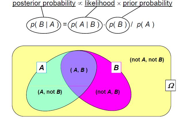
Source: mee11dlsud.wordpress.com
Here, set A represents all possible data we could observe, while set B represents all possible parameter values for our model. The intersection of A and B corresponds to data and parameters that are consistent with each other.
Let’s say that we know that we are in set A, and wish to know the probability that we are also in set B. Intuitively, you can see that this would just be the area of the intersection over the total area of the A. i.e.
\[\begin{align} p(B\mid A) = p(B\cup A)/p(A) \end{align}\]and similarly
\[\begin{align} p(A\mid B) = p(A\cup B)/p(B) \end{align}\]The two intersection probabilities are the same thing, so we can rearrange this to,
\[\begin{align} p(A\mid B) p(B) = p(B\mid A)p(A), \end{align}\]which is simple rearrangement to,
\[\begin{align} p(A\mid B) = \frac{p(B\mid A)\,p(A)}{p(B)}, \end{align}\]and voila! Bayes’ theorem. If you still don’t feel that this satisfies your understanding, the man 3Blue1Brown also did a whole video on this concept.
This theorem is the cornerstone of Bayesian analysis, allowing us to update our beliefs about model parameters as new data becomes available. By combining the likelihood with prior knowledge, we can calculate the posterior distribution, which represents our updated understanding of the parameters.
Applying Bayes’ theorem to the straight line
Going back to original formula for Bayes’ theorem. For our specific case, this looks like,
\[p(m, c\mid \vec{y}, \vec{x}, \sigma) = \frac{\mathcal{L}(\vec{y}\mid \vec{x}, m, c, \sigma)\pi(m, c)}{\mathcal{Z}(\vec{y}\mid \vec{x}, \sigma)}.\]And this is where the Bayesian analysis officially starts.
One of the beautiful things about Bayesian analysis is the explicit quantification of our assumptions, you might have noticed that at the beginning I restricted our \(m\) and \(c\) values and otherwise presumed any value of \(m\) or \(c\) was equally probable, which later kind of sneaked it’s way in by the range of values that I tested. In Bayesian analysis we place this information into the prior! In essence,
\[\begin{align} m &\sim \mathcal{U}(0,10) \\ c &\sim \mathcal{U}(-10,10)\end{align}\]where
\[\pi(m,c) =\pi(m)\pi(c).\]Slightly less basic (incorrect) thing
Now we’ll brute force the values like before but now we’ve explicitly included our assumptions into the model.
import numpy as np
import matplotlib.pyplot as plt
from scipy import stats

# Define grid
m_values = np.linspace(0, 2, 101)
c_values = np.linspace(-3, 4, 101)
m_mesh, c_mesh = np.meshgrid(m_values, c_values, indexing='ij')

# Assume ln_likelihood is a function you have defined
unnormalised_log_posterior_values = unnormalised_log_posterior(y, X_true, m_mesh.flatten(), c_mesh.flatten(), sigma=1).reshape(m_mesh.shape)

# Flatten grid and normalize likelihood
data_points = np.vstack([m_mesh.flatten(), c_mesh.flatten()])
unnormalised_log_posterior_values = np.exp(unnormalised_log_posterior_values.flatten())
weights = unnormalised_log_posterior_values / np.sum(likelihood)

# Apply Gaussian KDE with weights
kde = stats.gaussian_kde(data_points, weights=weights)

# Evaluate KDE on the grid
pdf_values = kde(np.vstack([m_mesh.ravel(), c_mesh.ravel()])).reshape(m_mesh.shape)

# Define confidence levels (e.g., 1σ, 2σ, ...)
sorted_pdf = np.sort(pdf_values.ravel())[::-1]
cumulative = np.cumsum(sorted_pdf) / np.sum(sorted_pdf)
confidence_levels = [sorted_pdf[np.searchsorted(cumulative, level)] for level in [norm.cdf(val)-norm.cdf(-val) for val in range(1,4)]]  # 1σ, 2σ, 3σ

confidence_levels = np.sort(confidence_levels)

# Plot
plt.figure(dpi=200, figsize=(8,6))
plt.pcolormesh(m_values, c_values, pdf_values.T, shading='auto', cmap='viridis')
plt.colorbar(label=r'$\mathcal{p}(m, c\mid \mathbf{y}, \mathbf{x}, \sigma)$')
plt.contour(m_values, c_values, pdf_values.T, levels=confidence_levels, colors='white', linestyles='--', linewidths=1.5)
plt.scatter([m_true], [c_true], c='tab:red', marker='*', label='True Value', s=50)
plt.xlabel("m")
plt.ylabel("c")
plt.legend()
plt.title("Unnormalised Posterior Credibility Contours")
plt.show()

This looks the same as the previous plot, as our priors were uniform, meaning the overall change is a multiplicative constant. And if we normalised our values (to make them a probability density) this constant disappears. So, we were lucky that the likelihood and posterior are the same.
Issues
Woo! We have a probability density on our parameters. However, there are a few subtleties that I failed to mention.
Most interesting models have more than 2 parameters. Let’s say you have a 10 parameter model, and wish to look at just 10 values in each dimension. This corresponds to \(10^{10}\) (10 billion) evaluations of the function, which by itself is a little ridiculous, but if we were to store all those values at the same time, presuming 64bit precision, this is approximately 640GB (~54 times the size of Skyrim)… not great. Additionally, we were lucky that the posterior wasn’t much smaller than our prior, so we could zoom into the relevant region of parameter space. However, if we had enough data then the posterior could be small enough that the posterior values that evaluated may not see anything meaningful above 0. I’ll get back to this one later.
There’s a bias in the gradient values towards positive values. Naturally you might presume that the gradient values are uniformly distributed between angles of -90 degrees to 90 degrees. With our assumption, there are a lot more large values than small values. e.g. If we look at the gradients that we implicitly presumed looking at uniformly spaced values of m between 0 and 10 it would look like the following. (Thanks Dr. Casey for inspo on this particular plot.)
x = np.linspace(-1, 1, 101)

fig, ax = plt.subplots(figsize=(4, 4), dpi=400)

for m in np.linspace(0, 10, 100):
    ax.plot(x, m*x, "-",c="tab:blue", lw=0.5, alpha=0.5)

ax.set_xlim(-1, 1)
ax.set_ylim(-1, 1)

ax.xaxis.set_major_locator(MaxNLocator(4))
ax.yaxis.set_major_locator(MaxNLocator(4))

ax.set_xlabel(r"$x$")
ax.set_ylabel(r"$y$")

fig.tight_layout()
plt.savefig("possible-bad-gradients.png")
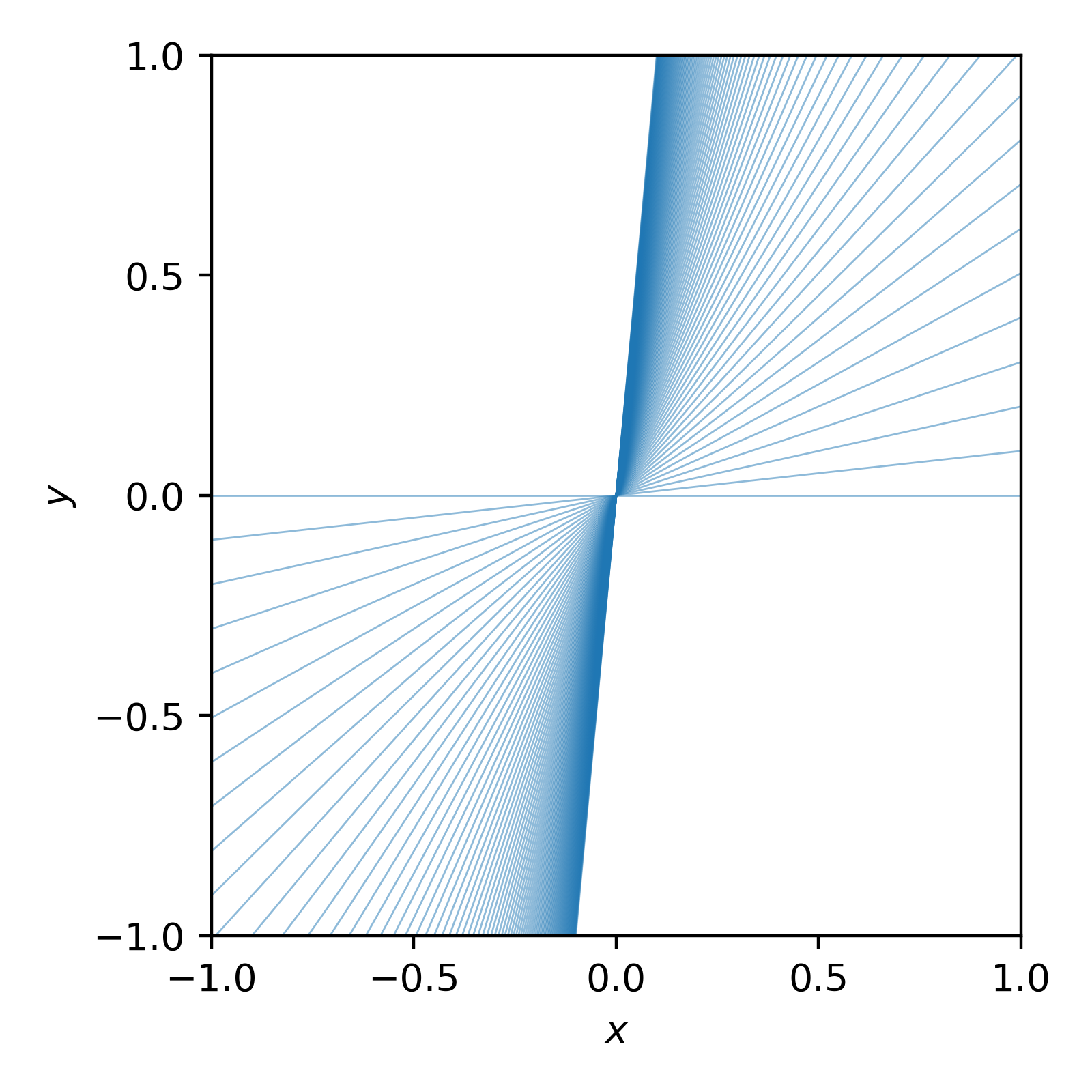
You can see that we heavily preferred larger gradient values. We can instead ask that our gradients are uniformly distributed by the sine of the angle, where the angle is given by \(\theta = \tan^{-1}(m)\) (where \(\theta\) is angle here not “parameters”).
In essence,
\[\begin{align} \pi(sin(\theta)) = const. \end{align}\]then,
\[\begin{align} \pi(m) &= \pi(\theta) \left|\frac{d\theta}{dm}\right| \\ &\propto \left|\frac{d}{dm} \sin(\tan^{-1}(m))\right| \\ &= \left|\frac{d}{dm} \frac{m}{\sqrt{1+m^2}}\right| \\ &= (1+m^2)^{-3/2}. \\ \end{align}\]When I first encountered this, I found it confusing—but visualizing random samples from the distribution personally helped solidify my understanding. I can’t show how I generated these samples without getting sidetracked, but trust me that this is what random samples of our new distribution looks like.
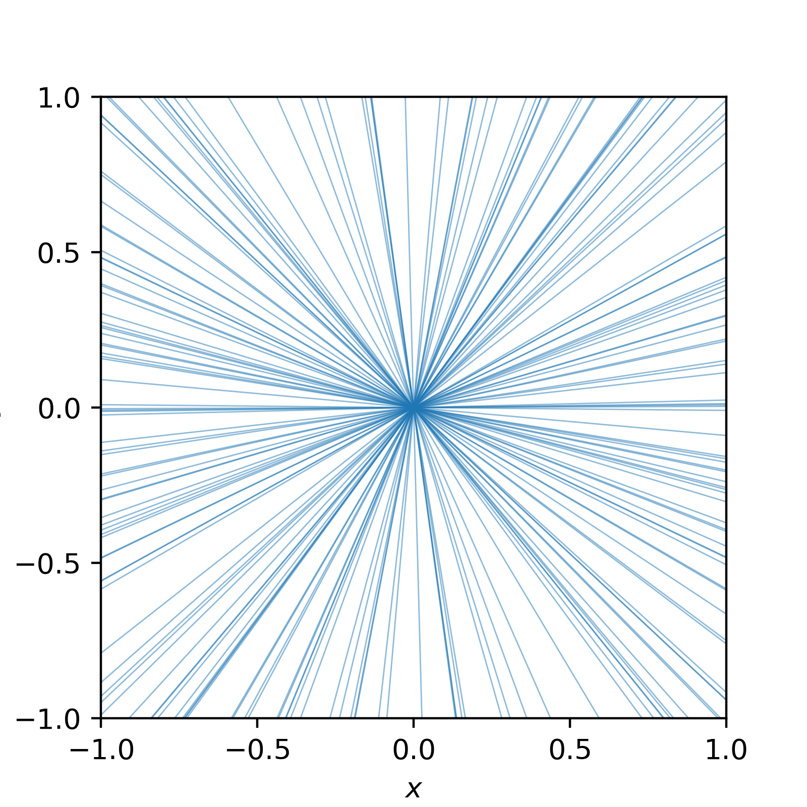
Much better!
Now if we use this prior in our analysis, we don’t include the bias (spoiler alert, for our small case it doesn’t make a huge difference).
What’s Next?
As our models grow more complex, brute force quickly becomes impractical due to the curse of dimensionality. In the next few posts, I’ll introduce more sophisticated techniques, such as Markov Chain Monte Carlo (MCMC), to explore the posterior efficiently. I’ve written another post on that here.
Otherwise, feel free to try and replicate what I’ve done here. You could also take it a step further and look at simultaneously fitting the spread of the gaussian \(\sigma\) which you may have noticed has been left as an explicit dependency.
